


Designing with bold colors doesn’t mean you have to give up calm, cohesive spaces. In fact, the secret to making bright, energetic interiors feel intentional, not overwhelming, is often in the neutrals. Soft, grounding tones like sand, oat, or warm grey can bring balance, letting your favorite bold pieces shine while maintaining a sense of serenity. Whether you’re designing a family room, a child’s play area, or a modern kitchen, layering in neutrals is what makes a bold design scheme feel livable and beautiful.
Why Neutral Tones Are Key to Balancing Bold Design
Bold colors bring life to a space, but without a foundation to ground them, they can quickly tip into visual overload. That’s where soft neutrals come in. Shades like ivory, oatmeal, clay, or warm gray provide contrast without clashing. They let saturated tones breathe while adding their own quiet elegance.
In family homes, especially, where toys, art projects, and daily life naturally introduce color, neutrals offer calm. They create visual rest for the eyes and emotional ease for the people living in the space. Neutral walls, flooring, and large furniture pieces set the stage for pops of coral, navy, forest green, or mustard to shine, without overwhelming the room.
For design-forward parents, neutrals are more than a safe bet. They're a deliberate choice to create balance in a space that needs to feel both inspired and relaxed.
Key Principles for Mixing Neutrals with Bold Colors
Pairing neutrals with bold design elements requires more than a lucky guess—it’s a strategy rooted in balance, tone, and texture. Here’s how to do it well:
Follow the 80/20 Rule. A strong design typically uses 80% neutral tones and 20% bold accents. Neutrals create cohesion and flow, while bold colors inject personality in just the right dose. This keeps a room feeling dynamic without becoming chaotic.
Match undertones. Not all neutrals are the same—some are warm (like sand or beige), others cool (like slate or greige). Aligning the undertones of your neutrals and brights creates harmony. For instance, a terracotta accent pairs beautifully with creamy neutrals, while navy complements cooler grays.
Add texture, not just color. Natural materials like wood, boucle, linen, or jute help soften the contrast between neutral and bold. They bring depth and tactile warmth, especially when color is restrained.
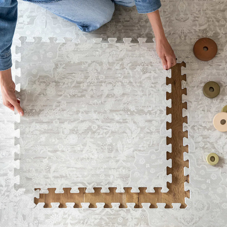
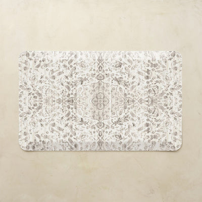
House of Noa mats, like the neutral-toned Play Mats or minimalist anti-fatigue options, are ideal foundations for this type of palette. Their soft textures and low-key prints provide visual grounding while allowing bolder accents, whether in artwork, textiles, or furniture, to take center stage.
Neutral Foundations That Support Bold Statements
To make bold design elements feel intentional, you need a strong foundation, and neutral tones offer exactly that. Think of them as the canvas that allows vibrant color, striking shapes, or graphic art to truly pop.
Start with large surfaces: wall color, flooring, and core furniture. Soft whites, greiges, oat tones, or muted taupes create calm and cohesion. Add natural textures, wood floors, linen curtains, boucle upholstery, to introduce warmth without overwhelming the eye.

This is where House of Noa products shine. Our neutral Play Mats, Tumbling Mats, and Standing Mats are designed to blend into existing decor while softening the space, both visually and physically. Use a tonal mat beneath a bold armchair or patterned wallpaper. In a kids’ play corner, a neutral mat allows colorful toys or book covers to become the star without creating visual clutter.
The result? A space that feels layered, balanced, and effortlessly put together, even when life (and color) gets loud.
Room-by-Room Guide to Soft Neutrals + Bold Color Pops
Living Room
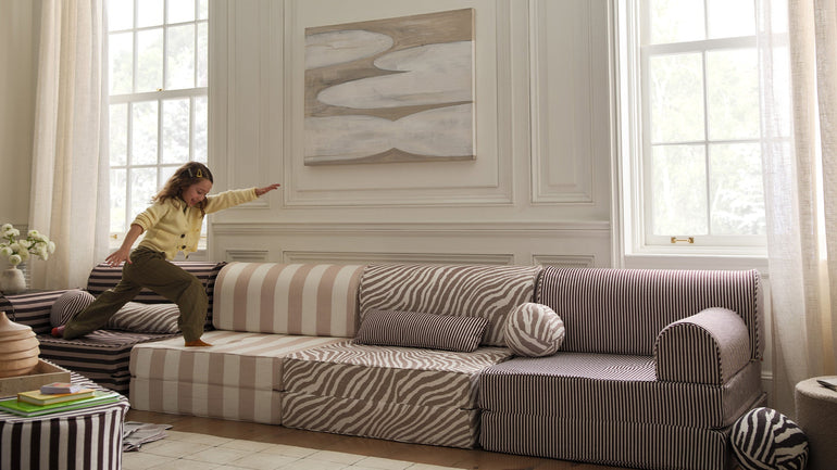
The living room is often the heart of the home, and a neutral palette helps create a calm base that still allows for personality. Start with a warm neutral rug or soft modular furniture to anchor the space. Add color through accent pillows, artwork, or a bold-colored occasional chair.
Instead of traditional sofas or bulky seating, House of Noa’s Soft Modular Furniture makes it easy to create a flexible, family-friendly lounge zone. The Seat in Boucle Truffle pairs beautifully with the matching Ottoman, giving you cushioned comfort, kid-safe softness, and machine-washable covers that handle daily mess with style.
Playroom
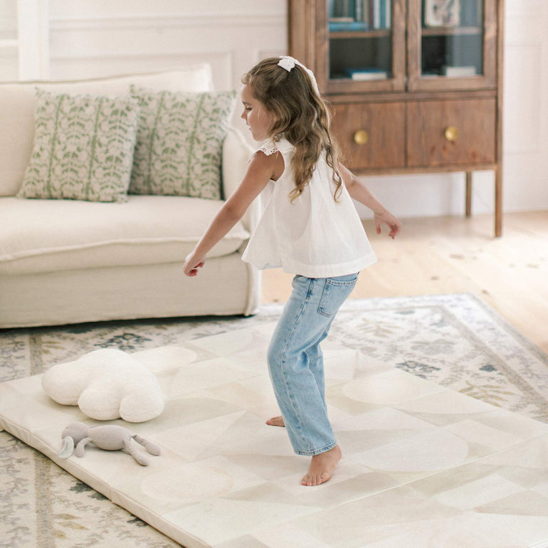
A neutral base helps tame the visual chaos of a playroom. Choose a soft, neutral Tumbling Mat or Play Mat as the anchor, then add boldness through toy storage bins, wall decals, or artwork. This approach makes the space fun for kids, but stylish enough for the rest of the home.
House of Noa’s hand-illustrated mats offer enough detail to be interesting, but never busy, ensuring your color accents feel curated, not cluttered.
Kitchen & Dining
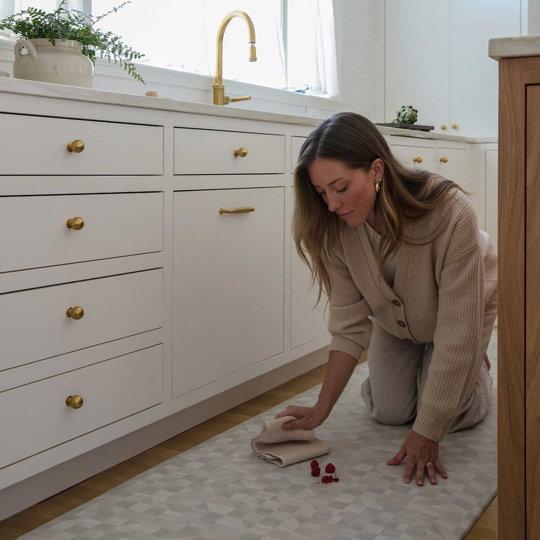
In high-traffic, functional spaces like the kitchen, use neutral anti-fatigue mats under the sink or stove area. Keep cabinetry and countertops clean and soft in color, then let bold elements, like pendant lights, stools, or dishware, do the talking.
House of Noa Standing Mats bring ergonomic comfort without disrupting the visual harmony. Their neutral designs make them ideal layering pieces that quietly support more expressive design choices.
Common Mistakes to Avoid When Combining Bold & Neutral
While neutrals and bolds can coexist beautifully, a few missteps can quickly throw off the balance. Here’s what to watch for:
Mixing undertones. Pairing cool-toned neutrals with warm bolds, or vice versa, can make a space feel mismatched. Choose neutrals that echo the temperature of your accent colors for a more cohesive look.
Overdoing bold accents. When everything’s a statement, nothing stands out. Limit your bold moments to one or two key pieces per space, a colorful rug, a dramatic art piece, or a pop of color on cabinetry and let everything else support it.
Ignoring texture. Color alone isn’t enough. Without varied materials—like natural wood, boucle fabrics, or matte finishes—even a well-colored space can feel flat. Texture adds richness and makes neutrals feel intentional, not just safe.
Forgetting about function. Especially in family homes, it’s easy to choose design over practicality. But foundational pieces like play mats, tumbling mats, and standing mats can be both functional and style-driven if you choose wisely.
House of Noa’s products strike that balance, offering clean, calming palettes with real-life durability, so your design choices look great and live well.
Final Styling Tips: Cozy Meets Confident
Designing with both neutrals and bold elements is an art, but it’s also deeply personal. The key is to create a space that feels balanced, reflects your family’s style, and actually works for how you live.
Start with what grounds you. Choose foundational pieces in calming, neutral tones—like a soft-toned rug, modular sofa, or a cushioned mat. These set the mood and give your eyes somewhere to rest.
Layer in bold intentionally. Let one or two pieces carry the color story—maybe it’s a burnt orange reading chair, a cobalt backsplash, or a large-scale botanical print. Against a neutral backdrop, these elements feel confident, not chaotic.
Bring in nature. Natural wood finishes, woven baskets, and greenery soften the lines and bridge the gap between color and calm. They make a neutral space feel lived-in and loved.
Use design to support daily life. House of Noa mats blend seamlessly into this philosophy. With soft palettes, wipeable surfaces, and family-friendly comfort, they work hard in the background, so your bolder choices can take center stage.